Rounded Tab Button

Making a Rounded Tab Button

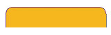
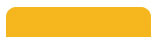
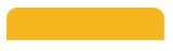
The basic rounded rectangle button is very versatile. Here, we're going to convert it into the popular rounded tab button like the one shown here.
Solution

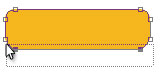
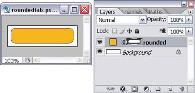
  1. Start with a rounded rectangle vector shape, as shown below.


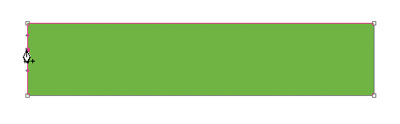
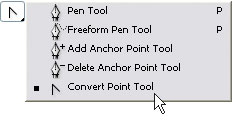
  2. Select the Convert Point Tool, which is in the flyout menu for the Pen Tool (P). Click once on each of the two anchor points, as shown below, to convert them from curve points to angle points.
  3. Use the Direct Selection Tool (A) to make a selection around the two bottom-most anchor points on the shape. To indicate that they have been selected, the points will turn from white squares to filled squares, as shown here.
  4. Delete the anchor points by pressing Backspace or Delete on the keyboard. Your image should now resemble the one shown below.
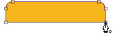
  5. With the Pen Tool (P), click first on the bottom anchor point on the left-hand side, and then on the point on the right-hand side, as shown below.

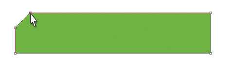
    This will draw a line connecting the two points and complete the shape, which is shown below.
Making a File Folder Tab Button

In this solution, you'll learn how to create a nice file folder tab, shaped much like those real folder tabs used in filing cabinets. Remember those old-fashioned things?

Solution
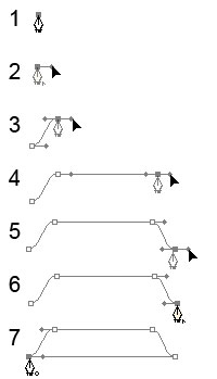
  1. Using the Pen Tool (P), click once to add an anchor point to your Photoshop document (step 1 in the image above.)

  2. Position the cursor over the anchor point. Hold down Shift and Alt (Shift and Option on a Mac), click on the point, and drag the mouse towards the right to create a single horizontal handlebar (step 2 above).

  3. Position the cursor as shown in step 3. Click and drag the mouse towards the right to add another anchor point. The line connecting the two points should display a nice curve, thanks to the positions of our control handles.

  4. Holding down Shift, click and drag the mouse to the right of the last point we made in order to create another anchor point with horizontal control handles. Press Shift to ensure that the two points are aligned horizontally (step 4 above).

  5. Move the cursor a bit lower and to the right so that it's aligned horizontally with our first anchor point (step 5). Click to add another anchor point and drag the handlebars out to the right.

  6. Bring the cursor back over the last point we made. Hold down Alt (Option) and click to remove the right handlebar (step 6).

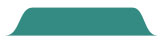
  7. Bring the cursor back to our very first point and click on it to complete the shape (see step 7, and the graphic below).

    Don't worry if your alignment's not perfect -- you can use the Direct Selection Tool (A) to select individual points, and the arrow keys to fine-tune them.
Summary

In the two instalments of this article, I showed you how to make all sorts of buttons! Beyond the obvious navigation buttons, the techniques you've learned here will allow you to make nifty bullet graphics and fancy title bars. For example, you could apply the plastic button effect to a longer rectangle that forms part of your interface, or use it as a bar for text links. You could also use the shiny metal button effect to create shiny metal bullets; you've got a gazillion options!

The experience you've gained with layer styles and vector shapes in this chapter will be invaluable when you're creating full web site comps. More, much more, on other elements of beautiful web site design can be found in the rest of my book, The Photoshop Anthology: 101 Web Design Tips, Tricks & Techniques. Don't forget to download your copy, courtesy of 99designs, before the opportunity is over!
Pearl Button - 1

Making a Pearl Button

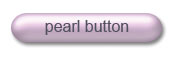
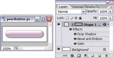
Here's a solution that uses real magic ... well, almost! We're going to take the glassy button we created in "Making a Glass Button" and turn it into a pearl button.

Solution

  1. Start with the glassy button you created in the solution titled "Making a Glass Button." Change the fill of the button layer to 100%, as shown, and use a very light, "pearly" color for the shape. I've used #fae1f9 for my pink, pearly button.


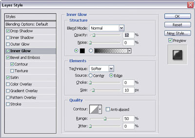
  2. Enhance the three-dimensional effect of the button by adding a slight inner glow. Double-click on the f icon for the layer to bring up the Layer Style dialog, shown below.

    Select Inner Glow and change the Blend Mode to Normal and the Opacity to 10%. Increase the Size if you need to.

  3. We'll also make the drop shadow a bit more subtle. Select Drop Shadow and decrease the shadow size to 3px or 4px.

  4. Finally, add your text layer. Here we see our final button -- all done!

Making Angled Tab Buttons


In this solution, I'll show you how to use vector graphic tools to create the angled tab buttons illustrated below.

Solution

Angled Tab

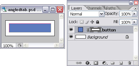
  1. Start with a rectangular vector shape in a color of your choice. I've used a light blue in the image below.
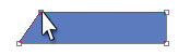
  2. Using the Direct Selection Tool (A), select the top left-hand anchor point of the rectangle. Hold down the Shift key and move the point to the right by pressing the right arrow once or twice. Your image should look something like the one below.

    Release the Shift key and use the arrow keys to fine-tune the point. We'll go "old school" here and count the number of times we press the arrow key so that we know how far to move the point on the right-hand side when we get to it.

  3. Repeat step 2 for the top, right-hand anchor point.

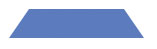
That's it -- believe it or not, our angled tab button is complete! If you don't believe me, look at the finished result below.

Cut-corner Tab

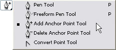
  1. This time, we'll make a tab button with a cut corner. Again, start with a rectangular vector shape. Select the Add Anchor Point Tool -- you'll find this in the flyout menu of the Pen Tool (P), shown here.

  2. Add an anchor point to the side of the button as I've done in the example below (you might need to zoom in).

  3. Choose the Convert Point Tool, which is also in the flyout menu of the Pen Tool (P).
  4. Using the Direct Selection Tool (A), click on the top corner anchor point and use the arrow keys to move the anchor point across to form a "cut corner," as illustrated below.

  5. If you like, repeat the effect on the other side.

Glass Button

Making a Glass Button

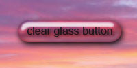
In this solution, we're going to create an eye-popping glass button that's particularly effective when it's overlaid on photographs and non-solid backgrounds.

Solution

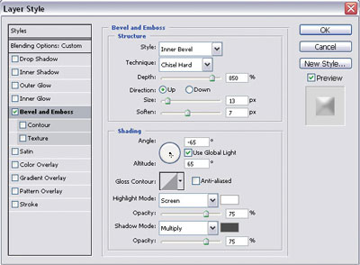
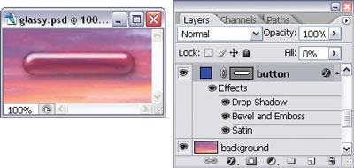
  1. Start with a vector button of any shape in a color that blends in with your background. Here, I'm using a pink that I color-picked from the sunset image onto which I'm going to place my button. Set the fill for the button layer to 0%. Open the Layer Style dialog by clicking on the Add a layer style button at the bottom of the Layers palette and selecting Bevel and Emboss... from the menu that appears. Apply the settings used here, which are illustrated in the dialog below:
    • Style: Inner Bevel
    • Technique: Chisel Hard
    • Depth: 800% (or larger, depending on the size of your button)
    • Direction: Up
    • Size: 13px (You may need to adjust this later.)
    • Soften: 7px
    • Angle: -65 degrees
    • Altitude: 65 degrees
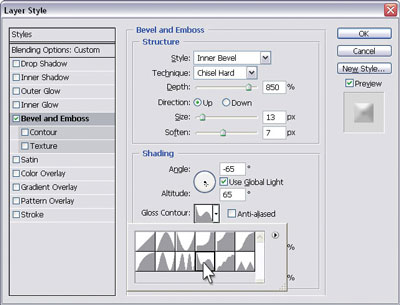
    • Gloss Contour: Rolling slope-descending (Set this by clicking on the drop-down arrow next to the contour shape and choosing the Rolling slope-descending option, as depicted below.)
    • Highlight Mode: White, 75%
    • Shadow Mode: Dark gray, 75%

    Setting Gloss Contour

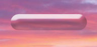
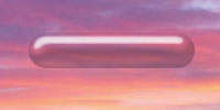
    Your button should be looking like the one shown below.

    After applying a Bevel and Emboss effect

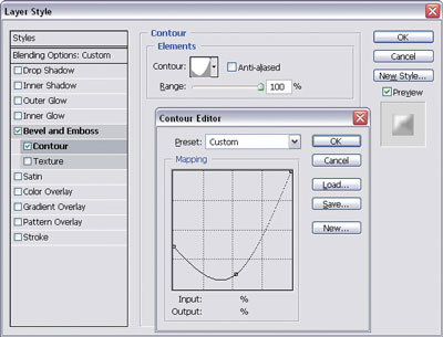
  2. In the Layer Style dialog, click on the Contour style under Bevel and Emboss to select it. Click on the thumbnail image of the contour to bring up the Contour editor, shown below.
  3. Select and move the bottom-left point of the contour until it's positioned just above the first horizontal grid marker. Then, click on the contour line to add another point and drag it to form a curve.

    The image below shows our button after the contour effect has been applied.

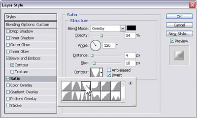
  4. Not bad, huh? Now, select the Satin layer style and apply the settings shown here:
    • Blend Mode: Overlay; black
    • Opacity: 30-40%
    • Angle: 126 degrees
    • Distance: 4px (You may need to adjust this later.)
    • Size: 10px (You may need to adjust this later.)
    • Contour: Cone-inverted
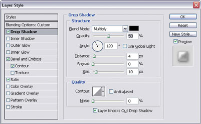
  5. Select the Drop Shadow layer style. Change the Distance to 4px, the Size to 10px, and the Opacity to 50%, as shown in the example below.

    At this stage, our button's looking quite glassy, as can be seen in the image below.


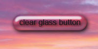
  6. All we need to do now is add a simple text layer with a slight drop shadow! Your completed button should look like the image below.

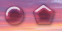
You can easily copy this layer style to other shape layers. When you do, remember to set the new layer fill to 0%. Experiment with the layer effects to change the look of your button. The images here show variations of my glass button.

Plastic Button

Making a Plastic Button

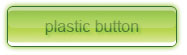
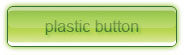
In this solution, we'll be using Photoshop magic to turn our friend, the basic gradient button, into a plastic button like the one shown here.

Solution

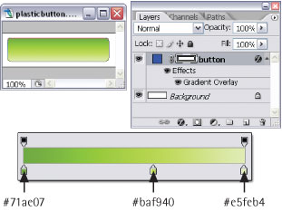
  1. Start with a rounded rectangle gradient button that has a radius of 5px. You can change the radius in the Rounded Rectangle options bar. Use the color stops shown here in your gradient overlay layer style. If you're unsure of how to do this, look at the solution for "Making a Gradient Button." I've made my button green, but you can use different colors for yours if you like. Just choose a darker shade of your color for the color patch on the far right, a very light shade for the color patch on the far left, and a bright shade for the patch in between, as shown here.
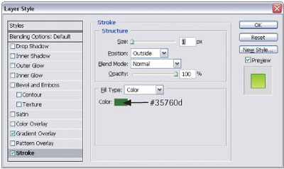
  2. Add a dark green, 1px stroke layer style to your button, as shown below.
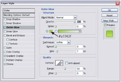
  3. Add an outer glow using a bright version of the button color, as shown below.
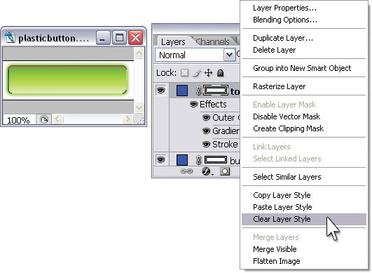
  4. Select the button layer in the Layers palette and duplicate it using Control-J (Command-J on a Mac). Right-click (hold Control and click) on the new layer and select Clear Layer Style from the menu that appears, as shown.
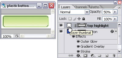
  5. Change the Opacity of this layer to 50%, and double-click on its color patch to open the Color Picker. Set the color of the shape to white, as shown.

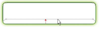
  6. Now, click on the vector shape for the same layer in the Layers palette. Using the Direct Selection Tool (A), click on the bottom line of the rounded rectangle and drag it up a little bit, as shown. You may need to zoom in for this.

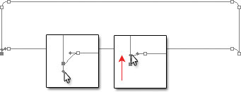
  7. Still using the Direct Selection Tool (A), click on the bottom-left anchor point so that you can see the handlebars of the point (zoom in if you need to). Click on the bottom handlebar, hold down Shift, and drag the handle up to curve the corner.

  8. Repeat step 7 with the bottom-right point. The sides of your shape should now look like those shown here.

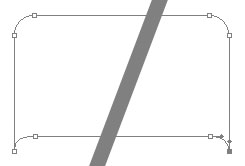
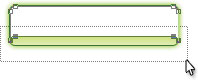
  9. With the Direct Selection Tool (A), click and drag the mouse to make a selection that captures all of the bottom points, as shown in the image here.

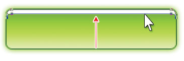
  10. Hold down Shift and drag the selected points up to make a thin strip, as shown below -- this is our highlight. Fine-tune the movement using the up and down arrow keys if you need to.

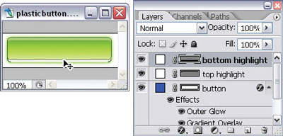
  11. Select the highlight layer in the Layers palette and duplicate it using Ctrl-J (Command-J). Select Edit > Transform > Flip Vertical to flip the duplicated layer.
  12. Use the Move Tool (V) to move the flipped highlight to the bottom of the rectangular button, as shown here.

  13. We're almost there! Now duplicate the button shape layer and name it middle highlight. Change the color of the shape to white.
  14. Select the bottom anchor points of the middle highlight shape and move them up to the center of the original button shape. Change the opacity of this layer to 25%, as illustrated in the image below.

  15. Add a text layer immediately on top of the original button shape (beneath the three highlight layers) and type your text. If you like, add a drop shadow for an added three-dimensional effect, as I've done for this completed button.